
What is no-fi?
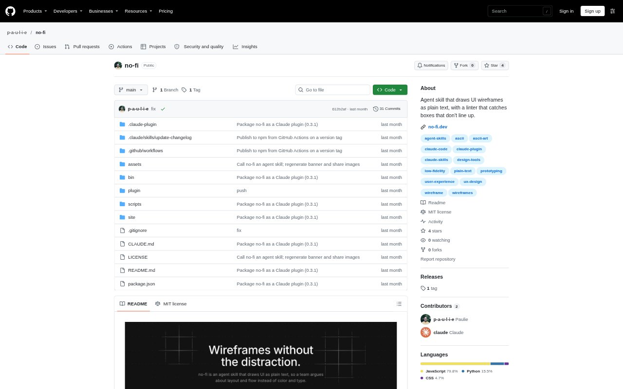
no-fi is an agent skill for creating UI wireframes as plain-text drawings, intended for teams who want to discuss screen structure before visual styling. Ask for a screen or sketch, and the agent produces a monospaced layout made from characters, with notes for visuals that need explanation. Its conventions cover common interface elements and charts, while a checker catches formatting problems before the wireframe is shared.
no-fi Features:
Plain-Text Wireframes: The skill represents screens with characters, box-drawing borders, and block characters rather than color, fonts, or icons.
Fixed-Width Layout: Wireframes use lines no longer than 80 characters, with aligned boxes and a consistent distinction between outer and inner borders.
Interface Vocabulary: A vocabulary of 44 elements across seven groups provides patterns for components such as inputs, buttons, modals, tables, and charts.
Open Component States: The conventions show states such as an expanded select menu or accordion with its contents visible in the drawing.
Wireframe Checker: A checker flags issues including misaligned borders, unsupported characters, inconsistent chart values, and missing chart legends.
Example Screens: Seven example screens demonstrate the vocabulary in contexts including transactions, notification settings, spending reports, and card details.
no-fi Benefits:
Structure First: By leaving out visual styling, teams can focus early feedback on layout, content, and user flow instead of debating colors or type.
Clearer Discussion: Consistent shapes for interface elements make it easier for collaborators to understand what each part of a proposed screen represents.
Fewer Formatting Errors: Catching alignment and chart inconsistencies before sharing reduces the chance that a broken drawing distracts from design feedback.
Reusable Conventions: A shared vocabulary gives teams a consistent way to sketch familiar interface patterns across different screens.
Quick Design Reviews: Text-based sketches make it practical to discuss an early screen concept without first producing a visually styled mockup.
Use Cases:
Payment Flow: Sketch a send-money form with multiple steps, field errors, a disabled action, and a tooltip explaining the restriction.
Settings Screen: Map notification preferences using toggles, checkboxes, radio options, a slider, accordions, and progress indicators.
Transaction Table: Plan a transactions view with search, an open filter menu, status badges, sortable columns, and pagination.
Spending Report: Lay out a report that combines budget progress with line, bar, and stacked-column charts.
Activity Trends: Explore patterns over time with a column chart, heatmap, sparkline trends, and a design annotation.